Other than calling, texting and just accessing the web, shopping these days is also done by mobile devices for convenience purposes. Forms are very important whenever one is shopping online.
Online shoppers are not thrilled by the need to fill in forms, but it is part of online shopping these days for the buyer to know what you need delivering, where and how you want it delivered. Here are ways you can speed up the performance of your customer’s mobile transactions in order to make their online shopping more exciting.
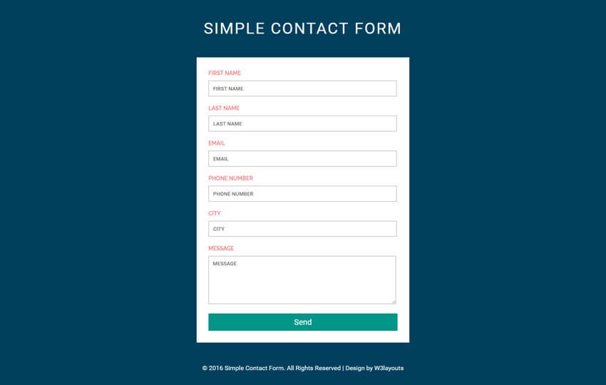
Online shoppers do not have enough patience to fill a whole webpage of forms when shopping online. As a developer, one should not create something that will bore them because you might end up losing a chance to make a sale.
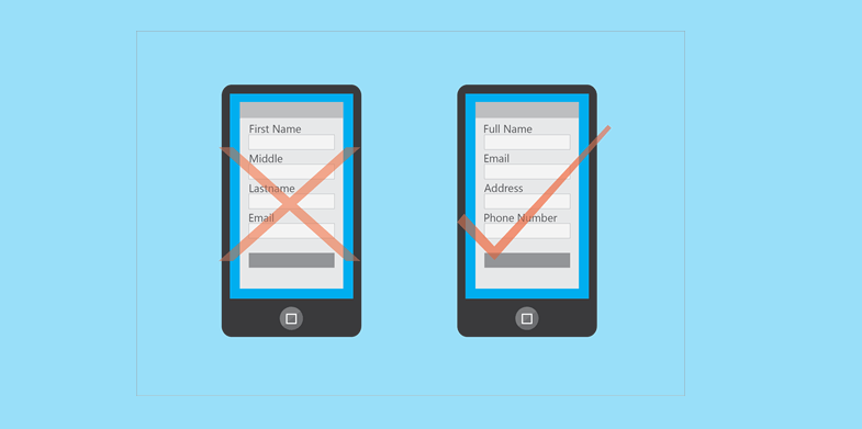
Split input entities, where shoppers are required to tap on three or two fields in order to answer only one label will backfire on you if your shoppers happen to be short of time. They could also be confusing; therefore simpler forms should be used for mobile platforms.

Due to their small screen size, Smartphones have a limited view when compared to computers. Therefore, it is important for a designer to design a form that can take care of this disadvantage perfectly. You can use a vertical alignment for the fields of your form so as to ensure that everything will fit on the view of the phone.

By doing this, your shoppers will not need to zoom to have a better view of your web page. Zooming might make them lose focus on the page and what is important. Use of a viewport Meta tag on your forms will keep them focused through to the end.
Many people are not so keen on filling forms. It would help a lot if you can provide your shoppers with a way to tell them how close they are to completing their experience. This can be done by percentage or just chronologically. If you have limited their steps, they will happy to fill the form fast. Knowing they are close to completion of the process will elevate their engagement.
1. Only include important details in your forms

Instead of asking for three different phone numbers, a developer should request for one phone number and make the form as easy to fill as possible. This way, your customers will enjoy their mobile shopping and shall also be more than willing to provide the few details required just to get that product they have liked on your page.
2. Go for single input entities

3. Use of top-aligned labels and fields

4. Set scale with viewport meta tag

5. Help your customers track their progress


0 Comments
Post a Comment