This is the level of attention to detail you need if you want your app to make it into our list of the best iPhone apps or the top iPad Pro apps. For more top tips, take a look at our guide to how to design app icons.
10 Stunning iOS app icon designs
Creating standout iOS app icons is an art in itself. The best app icons distil the essence of the app into one tiny square, which must stand out on a crowded desktop or App Store. In this article, we'll take a closer look at the best iOS app icons, and explore why they work so well.
This is the level of attention to detail you need if you want your app to make it into our list of the best iPhone apps or the top iPad Pro apps. For more top tips, take a look at our guide to how to design app icons.
With iOS app icons, it’s crucial to get things right. In the App Store, a good icon can make the difference between a sale and be ignored. And on the Home screen, great icons encourage engagement and therefore need to be compelling and easy to spot. To help you on your way, read on for a collection of beautiful, innovative and stylish app icons.
Facetune is one of the best photo apps around, and its iOS icon design is an equally standout effort. The tool is geared specifically towards taking perfect selfies, which is succinctly conveyed through the inclusion of the face within the icon. An on-trend gradient brings in the brand colours, while a touch of 3D makes the central circle look like a clickable button that you know you just want to tap on.
You probably know WeTransfer as a tool for sending large files, but the brand also has an award-winning immersive sketching app to its name. Paper's cool iOS app icon subtly mimics the 'W' of its parent company, while the dribbly colours within the outline hint at the app's creative function.
ustwo games' Monument Valley is a stone-cold modern classic – we've already been treated to a successful sequel, with a third in the works. Its iOS app icon sets you up perfectly for the peculiar adventure you're about to undertake. Straight off, it introduces you to the central character, Ida. It also gives you a taste of the game's minimal isometric stylings, wrapping everything up in a sense of mystery that's guaranteed to draw you in.
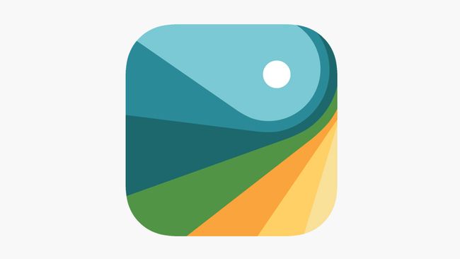
Tayasui Sketches is a drawing app that prides itself in effectively mimicking traditional art tools. Its pleasingly pared-back app icon features one of the tool's in-app drawing options. We applaud the fact the designer has eschewed a colourful, fussy design (common in the art app space), instead offering viewers what is essentially a blank canvas. The tool promises "a unique UI with a touch of Zen", and the icon captures that perfectly.
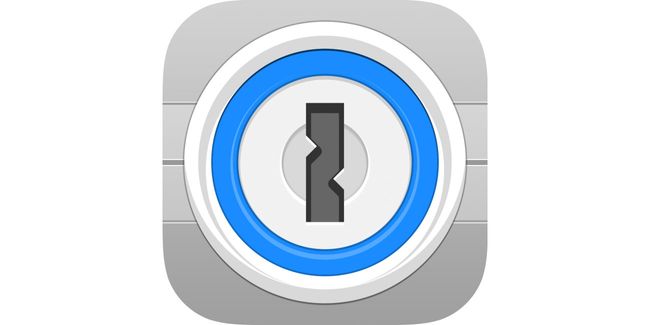
Zero marks for imagination here, going for the Captain Obvious padlock, but 1Password’s app icon immediately tells you what it's about. It will be easy to find on your iPhone or iPad and has authority in the app store. It conveys security at the heart of the app and service alike and makes users feel that whatever’s stored within will be safe.
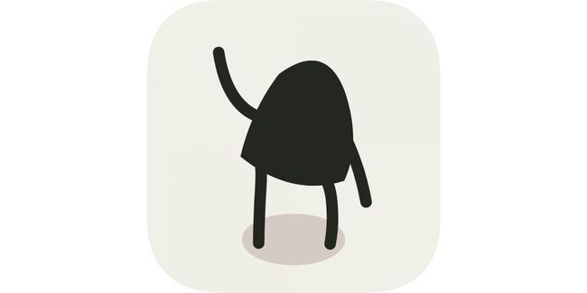
Game characters are usually too complex to be used in their entirety on an icon. Not so with A Good Snowman’s adorable monster. It stands out from other icons on your home screen and is even waving at you. It's impossible to resist unless you’re the monster.
For an app that’s the digital equivalent of felt shapes but that wants to seduce designers and kids alike, its iOS icon needs to be fun, creative, sharp, and colourful. Assembly's previous icon featured the brand's abstract bird logo, and it did a great job. However, if anything it was too detailed to 'read' properly at small sizes. This updated, pared-back replacement, featuring the same distinctive colour palette, is even better.
This game’s all about controlling living calligraphy, coaxing it to collide with targets. That concept’s too much for an icon, but Blek’s iOS app icon nonetheless gets across the game’s elegance and visuals with a swoosh and memorable lines.
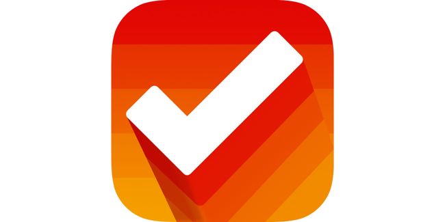
To-do app Clear Todos is one of approximately five million productivity apps using a tick. But this icon's positive, upbeat nature suggests how your life might be better when using the app, and the colours differentiate it from comparatively hum-drum, overly serious competition.
This is the level of attention to detail you need if you want your app to make it into our list of the best iPhone apps or the top iPad Pro apps. For more top tips, take a look at our guide to how to design app icons.
Tags
Webmobile


0 Comments
Post a Comment